Color Trends for 2021
/2021 has arrived, which means the introduction to a new set of on-trend colors!
Every year, paint companies, such as Benjamin Moore, Sherwin Williams, and Pantone, create a prediciton of what they believe the popular and on-trend colors will be for the next year. While the selection of colors may not be identical, they usually compliment one another.
With 2020 being quite a year, it seems that we all need a little bit of peace and tranquility in our lives starting in 2021. The color trends for this year definitely project that. The colors projected to be most popular this year portray comfort, well-being, and hope for the future. Sherwin Williams even uses the words “rhythm” and “balance” to describe their selection of colors. Benjamin Moore describes their color forcast as one that will make a home feel more like a home. Since many of us are having to stay home more often, creating a sanctuary of peace within one’s home seems ideal.
Let’s take a look at the top 3 paint companies’ Color of the Year and Color Trend predictions:
Benjamin Moore
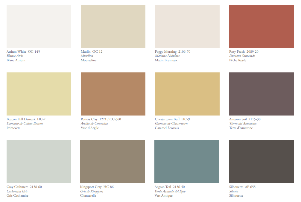
Color of the Year 2021 - Aegean Teal
image via
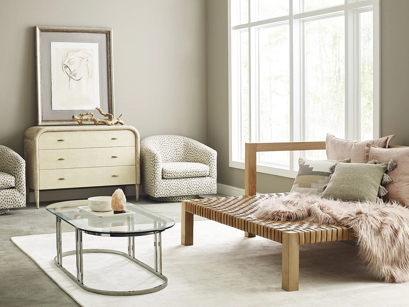
Benjamin Moore’s Color of the Year for 2021 is Aegean Teal, a warm and soothing blue. Along with the Color of the Year, they have selected twelve additional hues for their Color Trend palette. These colors would work great with linen fabrics and limestone countertops. The primary colors, red, yellow, and blue, are very present in this year’s selection of colors. These colors could represent the “going back to the basics” mentality that many of us have during this time - focusing on family, homelife, and health.
image via
Sherwin Williams
Color of the Year 2021 - Urbane Bronze
image via
The 2021 Color of the Year for Sherwin Williams is Urbane Bronze, a deep brown that seems the represent Earth’s natural stone and wood - a color to help keep one grounded. Sherwin Williams has also created four different palettes with colors that represent a diverse selection of styles - each with their own personality and charm.
Santuary
This palette contains warm neutrals and natural tones. These colors would work beautifully with wooden accents and simplistic tile.
images via
Encounter
The Encounter palette represents heritage and culture. These colors tend to compliment fun patterns and artisan craft-like decor.
images via
Continuum
This color palette is a futuristic look inspired by the sky and the deep sea. These colors look stunning with modern stones, sleek lines, and bright whites.
images via
Tapestry
The Tapestry palette contains bright pinks and greens and is inspired by elegancy. These colors look stunning with fun patterns, gold accents, and marble additions.
images via
Pantone
Colors of the Year 2021 - Ultimate Gray & Illuminating
image via
The Pantone Colors of the Year for 2021 are Ultimate Gray, a symbol of wisdom and dependability, along with Illuminating, a symbol of hope and positivity. This is only the second time in the past 22 years that Pantone has chosen two colors. The Pantone Color Institute felt that with all that has happened in 2020, there needed to be a marriage of opposing colors in order to represent strength and optimism for the new year as well as what can happen when we all come together and support one another. Pantone has also created five different color palettes that include the 2021 Colors of the Year. Notice that Pantone has a slightly different approach when deciding the Color (or colors) of the Year.
Aviary
Aviary is an upbeat and cheery pallete. These colors could definitely catch anyone’s eye and make quite a statement in any room.
image via
Enlightenment
The Enlightenment pallete contains youthful colors that represent the idea of blending one’s wisdom with new ideas and insights. These colors can be seen as futuristic and will bring new light to a space.
image via
Intrique
This palette is meant to represent the merging of different cultures. These colors can create a worldly aspect to your home.
image via
Orbital
The metallic tones seen in the Orbital palette represent the desire to see an increase in interstellar travel in this new year. These colors are as mesmerizing as the unknown of the galaxies.
image via
Sun and Shadow
The Sun and Shadow contain beautiful earth-like shades. This palette is slightly similar to the Benjamin Moore and Sherwin Williams colors. These colors, similarly to the Benjamin Moore and Sherwin Williams colors of the year, are meant to show the natural beauty of our environment.
image via
Whether you resinated most with Benjamin Moore, Sherwin Williams, or Pantone, each company has one similar idea when it comes to this year’s colors - Recognize the beauty within yourself and your surroundings. We can all hope that 2021 will be a year of growth and appreciation for the world and each other. This is the year to make your home a place of goodness!


