

Pantone Color of the Year
/
The Pantone Color Institute forecasts global color trends which influence brand identity and product development in industries ranging from textiles to beauty, graphic design, architecture and more. Each year Pantone selects a “Color of the Year” which they predict to be the trending color across industries for the coming year. You might see the color of the year in everything from furniture design to makeup to clothing, paint, and more. The color of the year has been influencing product development and purchasing for over 20 years, so it’s certainly something to pay attention to, whether or not you’re in the field of design.

image via
What is Pantone?
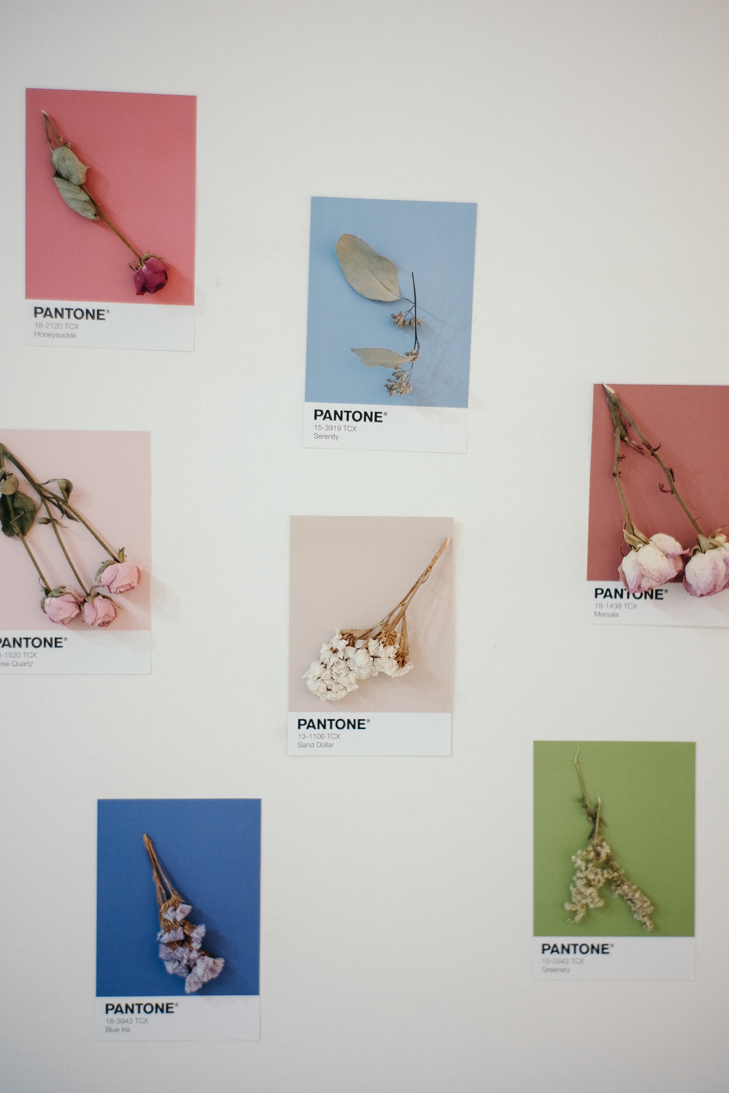
Pantone was founded in 1963 by Lawrence Herbert who developed a system for creating, matching, and identifying colors in a way that kept them consistent throughout the industries of textile and print. His work led to the creation of the “Pantone Matching System”, a book that standardized colors throughout those fields. Perhaps you’ve heard of CMYK, ie: cyan, magenta, yellow, and black, otherwise known as the 4 colors from which all of Pantone’s colors stem. CMYK is crucial to the world of design, and you’ll be hard pressed to find a designer who isn’t familiar with it and/or doesn’t use it in their career.
The Pantone Color Institute is who predicts the color of the year, the color that supposedly we’ll be seeing everywhere in the coming year. The color of the year is released every year in December, and many are anxiously awaiting what it will be for 2020!
The 2019 Color of the Year
Last year’s color, Living Coral was, according to Pantone, “An animating and life-affirming coral hue with a golden undertone that energizes and enlivens with a softer edge.” This vibrant coral “embodies [their] desire for playful expression”, and playful is certainly a good way to describe it!


image via
I think it’s safe to say that there aren’t many industries that haven’t been touched by the color of the year.
So the question remains...what will be the official 2020 color of the year? While we won’t officially know until December, we can take a guess by reviewing Panton’s recommendations for colors for the summer of 2020.
Pantone’s Summer 2020 colors

image via
All their choices for the summer of 2020 are bold, vibrant, and overall brilliant. There’s nothing shy about this line up of colors- they’re reminiscent of everything we love about summer: beach balls, ice cream, brightly colored hats and dresses, fun nail polish, and more.
Leading the pack is Flame Scarlet, a fiery red that screams “pay attention to me”. Following it up is Saffron, a yellow that’s deeper than lemonade and which more closely reflects sunshine on a hot summer day. Chive Green keeps the trend of food colors going, and Classic Blue is a dependable color that we’re sure to see in more than blue jeans (Meghan Markle, for one, is a big fan of dresses in Classic Blue.) Biscay Green is a bright aqua color that screams “vacation”, and Faded Denim has replaced classic navy with this comfortable shade that goes with everything. These are just a few of the summer headliners, and I think they’re a good indication that the official 2020 color of the year is going to be anything but boring. Check out Pantone’s website for the full lineup of color.
What do you think the color of the year will be? And where should we expect to see it emerge the most? In our clothing, food, technology, furniture, paint choices, interior design, or another facet of our daily lives? We’ll be on the lookout, so stay tuned!