Color Trends for 2022
/Goodbye 2021, hello 2022!
A new year has arrived and so have the newest design trends. The color trends for 2021 were all about balance, peace, and hope for the future. If you would like to learn more about the Color Trends for 2021, check out last year’s blog post. This year we are seeing some similarities with the previous year’s trends. The trends for 2022 are focusing on versatility, personality, and calming spaces. People are wanting to add their own spin on a design, while keeping a serine space. Sherwin Williams even describes their color as a “fresh start.”
Let’s take a look at 3 of the major paint companies’ ideas on these values within their Color of the Year.
Sherwin Williams
Color of the Year 2022 - Evergreen Fog
image via Vintage Revivals
Check out this absolutely gorgeous color of green from Sherwin Williams! Their color “Evergreen Fog” is a beautiful mix of green and grey with a hint of blue. Many would describe this color as looking “organic,” while still being sophisticated. This color would create a subtle statement for any room. Similarly to 2021’s push for incorporating nature within one’s interior design, this color can also be seen as bringing the outdoors in. This can be noticed especially with Sherwin Williams’s coordinating palette, as seen below.
image via Thistlewood Farms
Benjamin Moore
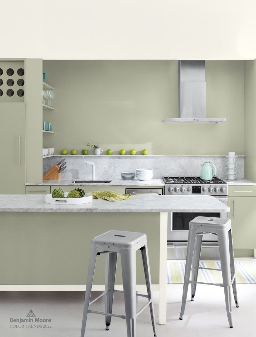
Color of the Year 2022 - October Mist
image via Benjamin Moore
Guess what! We have another green in the mix! Benjamin Moore chose this color for reasons similar to Sherwin Williams - individuality and harmony. This color can be used as a neutral in many spaces, giving you ample room to be creative with your designs. Benjamin Moore also describes this color as “meditative,” creating a room of peace and tranquility.
Benjamin Moore also has released a coordinating color palette for 2022:
image via Benjamin Moore
In our previous blog post, The Psychology of Color, we discussed different colors and how they effect one’s energy and mood - an important thing to know when choosing colors for your interior design. Green is actually known to slow metabolism and relieve anxiety. It is associated with health, productivity, connection, and growth. It is a great color for interior design because it can bring us back to a peaceful state. There are so many reasons to incorporate the color green in your interior design.
Pantone
Color of the Year 2022 - Very Peri
The moment we have all been waiting for… Pantone’s Color of the Year is here! Pantone’s color is usually a little bit different from other Color of the Year picks. This gorgeous violet with hints of blue is a color that encourages creativity and personal expression. This color is meant to represent our world’s shift to a more digital age. It represents hope for new possibilities.
It is important to know here, as well, how this color affects our mood. The color blue is associated with calmness and peace, which is an overall theme for this year. This color tends to lower one’s heart rate and slow metabolism. Purple is a combination of the colors red and blue; therefore, it has qualities of both. Along with the relaxed energy from blue, the red brings out power and independence. Together these colors create feelings of wisdom and confidence. The color Very Peri brings out a creative and inquisitive approach to seeing the future.
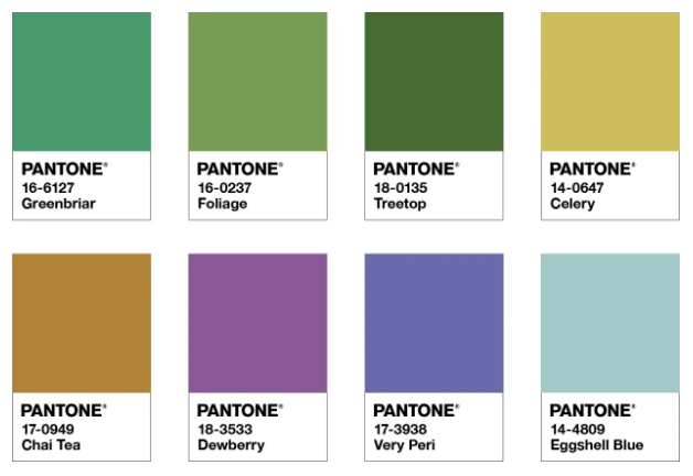
Pantone has also released color palettes featuring Very Peri to help you incorporate it into your own style:
Balancing Act
image via Pantone
Wellspring
image via Pantone
The Star of the Show
image via Pantone
Amusements
image via Pantone
After looking at these three beautiful colors by Sherwin Williams, Benjamin Moore, and Pantone, do you see a bit of a trend? We definitely do! Individuality, peace, and hope for the future seem to be a common idea for the 2022 year. Although Pantone’s color is a violet tone rather than the green of Sherwin Williams and Benjamin Moore, it still presents a calming feeling due to its blue undertones.
If you are just as in love with these trending colors as we are, let us know in the comments! We can’t wait to use more of these gorgeous colors in our tile projects this year.


